Canonical
16 July 2015
The monochromatic makeover
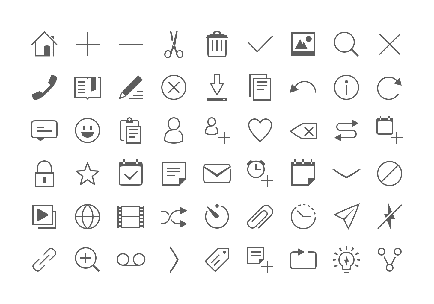
We have given our monochromatic icons a small facelift to make them more elegant, lighter and consistent across the platform by incorporating our Suru language and font style.
The rationale behind the new designs are similar to that of our old guidelines, where we have kept to our recurring font patterns but made them more streamlined and legible with lighter strokes, negative spaces, and a minimal solid shape.
What we have changed:
- Reduced and standardized the strokes width from 6 or 8 pixels to 4.
- Less solid shapes and more outlines.
- The curvature radius of rectangles and squares has been slightly reduced (e.g message icon) to make them less ‘clumsy’.
- Few outlines are ‘broken’ (e.g bookmark, slideshow, contact, copy, paste, delete) for more personality. This negative space can also represent a shadow cast.
Less solid shapes
Before

After

Lighter strokes
Before

After

Negative spaces
Before

After

Font patterns
Oblique lines are slightly curved

Arcs are not perfectly rounded but rather curved

Uppercase letters use right or sharp angles

Vertical lines have oblique upper terminations.

Nice soft curves

Action
Devices

Indicators

Weather